Post-pandemic fashion is leaving pre-pandemic style far behind. In the recent past, consumers looked towards glamorous movie stars, professional athletes, TikTokers and other celebrities for clues about color trends. Nowadays, consumers care less and less about them. The pandemic-weary people are now concerned – first and foremost- on their own wellbeing and how the colors can soothe or invigorate them. The emotional quality of color is really more impactful than anything else. Technology, sustainability and individualism are the new trendsetters. Consumers are now seeking hues (colors) that will convey a revitalization of calm through bolder shades- while giving a sense of calm. In this article, we will look at the two most prominent color trend reports and forecasts of Spring/Summer 2022.
PANTONE REPORT
Pantone, the global authority on color and provider of professional color standards for design industries, has announced the Pantone Fashion Color Trend Report Spring/Summer 2022 for New York Fashion Week (NYFW). This season’s report features the top ten standout colors, as well as current takes on the five core classics we can expect to see. As a global authority on Color, Pantone is the definitive source for predictions on which hues will define home designs, fashion and other creative industries in the coming months and year.
According to Pantone Colour Institute experts, colors for Spring/Summer 2022 reflect our aspiration for balance as we move through a changing landscape. Colors that evince our need for comfort, clarity and security satisfy our urge to stay with the familiar. At the same time, free-spirited optimism, and a feeling of new liberation, is unleashed in dynamic, stand-out shades, quenching our desire for spontaneity, uplift and joy.
“Colors for spring 2022 bring together our competing desires for comforting familiarity and joyful adventure through a range of soothing and timeless colors, along with joyous hues that celebrate playfulness. As we enter this new landscape, one where fashion rules no longer apply, hues for Spring 2022 allow us to mix and marry as we please, encouraging the exploration of new chromatic realities, opening the door for personalized style and spontaneous color statements,” said Leatrice Eiseman, Executive Director of the Pantone Color Institute.
Pantone’s spring 2022 color predictions have already made their impact at New York Fashion Week. Fashion designers and brands such as Gabriela Hearst, Proenza Schouler, Prabal Gurung, Carolina Herrera, Moschino and others have embraced the 15 spring 2022 trends the color institute revealed, with hues ranging from bright pinks and purples to soft neutrals.
The Spring/Summer 2022 NYFW Color Palette contains diverse and distinctive colors that come together to create a palette lending comfort and familiarity with unexpected delight. They are:
- PANTONE 12-4401 Spun Sugar: Spun Sugar is a sweetened pastel with an airy nature
- PANTONE 13-1513 Gossamer Pink: Soft and powdery Gossamer Pink has a light and tender touch.
- PANTONE 18-2042 Innuendo: High visibility Innuendo sends a tantalizing message.
- PANTONE 19-4151 Skydiver: Skydiver inspires us to new heights.
- PANTONE 14-0850 Daffodil: Joyful Daffodil connects us to the spontaneity of a spring garden.
- PANTONE 16-4118 Glacier Lake: Calming and cooling Glacier Lake conveys serenity and quietude.
- PANTONE 18-4728 Harbor Blue: HarborBlue reflects our search for a safe space.
- PANTONE 18-1019 Coca Mocha: Tasty Coca Mocha warms the spirit.
- PANTONE 18-3324 Dahila: Dahila is stand-out purple exuding a dynamic vibe.
- PANTONE 18-1564 Poinciana: A commanding heated red, Poinciana makes a dramatic statement.
The Spring/Summer 2022 core classics are classic, season less hues whose versatility expresses longevity. They include:
- PANTONE 11-0602 Snow White: Snow White is a clean and pure white, expressive of our desire for simplicity and uninterrupted inner peace.
- PANTONE 13-0003 Perfectly Pale: A subtle sandy beige, Perfectly Pale speaks to the soothing comfort of a warm, inviting beach.
- PANTONE 16-2616 Basil: Sweet and Savoury Basil emanates health and wellness.
- PANTONE 14-4104 Northern Droplet: Northern Droplet is a pale gray that instils feelings of tranquillity.
- PANTONE 18-4004 Poppy Seed: The silent powder of deep gray Poppy Seed contains timeless familiarity.
WGSN REPORT
WGSN, the global authority on trend forecasting in partnership with universal color system COLORO, has also laid out a vision of five key colors for Spring/Summer 2022. The partnership that brings these predictions unites WGSN’s trend forecasting expertise with Coloro’s revolutionary system of 3,500 color tones. It brings accurate and reliable color forecasting, with added intelligence from Coloro’s technical team on how to achieve the tones on different substrates.
In the color forecast, WGSN AND Coloro have balanced the desire for newness with the need for familiarity, with green, blue and yellow tones that feel reassuring and consistent, and juicy pink and orange tones that ring excitement and optimism to the season.
Jenny Clark, Head of Colour at WGSN says the future season’s shades are “driven by a desire to be uplifted and energized while staying grounded and balanced. Consumers will reconnect with tones that spark joy, whether from a nostalgic or a sensorial experience. These colours will either ground or entice us with their delicious and textural charm.”
With prolonged periods of isolation, nature and its vitality will have a clear appeal, but technology will also be celebrated as connections through digital tools become a more necessary and valued part of everyday life. The new season’s key colours reflect this duality, ranging from authentically organic hues to artificially enhanced tones.
The key color palettes for Spring/Summer 2022, with their relevant Color code are as follows:
- Orchid Flower Coloro 150-38-31: WGSN and Coloro have announced that Orchid Flower will take the lead among the five key colors predicted to gain worldwide popularity in Spring/Summer 2022. Joanne Thomas, Head of Content for Coloro notes “Orchid Flower has an intense, hyper-real and energizing quality that will stand out in both real-life and digital settings. It is also versatile enough to work across seasons and continents. In a challenging time, this saturated magenta will be a great way to create a sense of positivity and escapism.” Vibrant pinks are making an impact across active wear and occasion wear, especially for women, and this will continue with Orchid Flower, which will resonate across fashion, swimwear, interiors and beauty. With its purple undertone, it will appeal to men and women and be driven initially by the youth market.
- Olive Oil (Coloro 044-52-13): Green is a consistently important color, thanks to its association with nature, and for Spring/Summer 2022 we will see it shift to the nourishing plant-based hue of Olive Oil, which feels restful and balanced. This is a rich trans-seasonal tone with a timeless, comforting quality, and much like its namesake, it makes a great base to combine with other colors. Olive Oil will have broad appeal across outdoor active apparel, work wear denim, soft lingerie sets, footwear, accessories and interiors. For menswear and women’s wear, it will have particular relevance for practical, functional styles, which are gaining momentum.
- Butter (Coloro 040-86-20): Yellow has grown in popularity over the past three years, encompassing both saturated brights and pale tints. For Spring/Summer 2022, a desire for wholesome and nourishing experiences will drive yellow toward the softer tone of Butter, which has a creamy, almost edible quality. This is a comforting and adaptable color that will pair well with power pastels and accent brights. Warm buttery shades are already up-trending in luxury womenswear, and for Spring/Summer 2022 we will see this expand into menswear, lingerie and interiors- especially for luxurious and elevated styles. Butter also has a genderless appeal, making it perfect for kidswear, loungewear and casualwear.
- Mango Sorbet (Coloro 030-67-34): Optimistic colors such as Mango Sorbet will have a much clearer appeal in Spring/Summer 2022. This invigorating, tropical hue fuses the popularity of orange with the brightness of yellow, and can be used to add a much-needed dose of energy to seasonal palettes, enhancing feelings of wellbeing and health. Mango Sorbet will be perfect for swimwear, activewear and outdoor apparel, and will work as a surprising off-kilter bright for womenswear- especially for contemporary silhouettes. With its juicy quality, it can also be used to give a lift to homewares and interiors.
- Atlantic Blue (Coloro 115-35-20): The dependable, versatile and trustworthy appeal of blue makes it a perennially popular color. For Spring/Summer 2022, we have chosen the grounded, reassuring and transseasonal tone of Atlantic Blue, which echoes the hues of organic indigo dyes and the ocean, making it perfect for sustainable and heritage designs. Deep blues such as this are already being championed by slow-fashioned brands, and will be ideal for menswear. Atlantic Blue will also work as a classic core for womenswear, activewear and interiors, and as a directional tone for beauty color cosmetics.
WGSN AND Coloro are confident their aesthetic predictions will eventually fit with consumer desires, the exact timing of which is subject to factors far outside the usual concerns of the design world. “The biggest change to current color trends will be linked to the economic outlook,” Clark says.
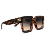
If you’re looking for the best sunglasses for 2022 then browse our website and choose some with these color trends.